The A.Z. Shmina website project has been one of the smoothest projects I’ve ever worked on. And I’m proud of the final result: a contemporary site that fully integrates messaging and design, and stands out from the competition. This post walks through the process of building the AZS website.
The Crew
Mike Bell, a colleague from Hile Creative, had been selected by AZS to establish an updated look and feel for the Shmina brand as well as a strategy and design for their upcoming 100th anniversary. Mike assembled the team for the job by bringing in Birdbrook Design to handle the design and development of the new website, and John McQuillan to provide content support and copywriting.
The Logo
Mike began with a logo update, offering a wide range of options from slight tweaks to completely new concepts, ultimately deciding on a subtle but impactful update to the existing logo. The familiar triangle logo mark is now more legible and evenly spaced, and the new font, with a corresponding break in the “A”, provides a more active, contemporary vibe to the logo type.

The Tone
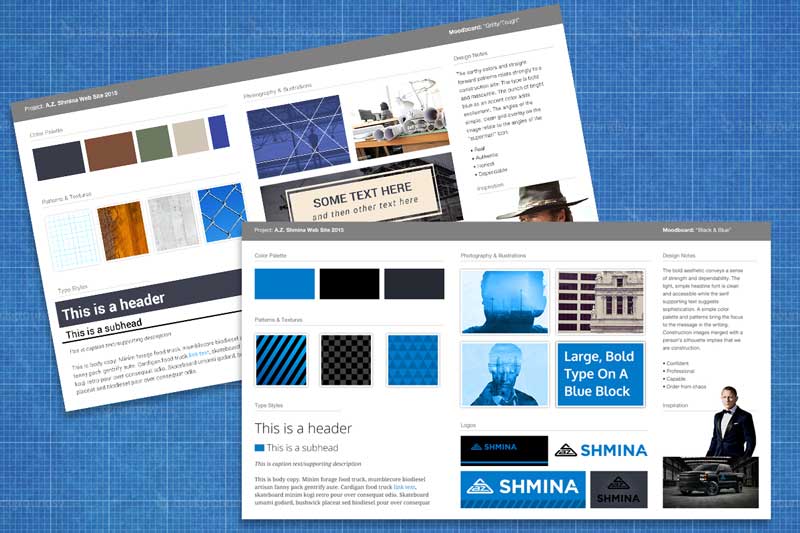
Once the logo was created, the next step was to define the general direction and tone of the new website and branding collateral. Mike created and presented mood boards that represented two possible directions with color palettes, image treatments, and typography to give a general sense of the character of the site. AZS chose the Black & Blue option. They felt the bold, direct design matched their no-nonsense approach to construction and helped to set them apart from their competitors.

The Framework
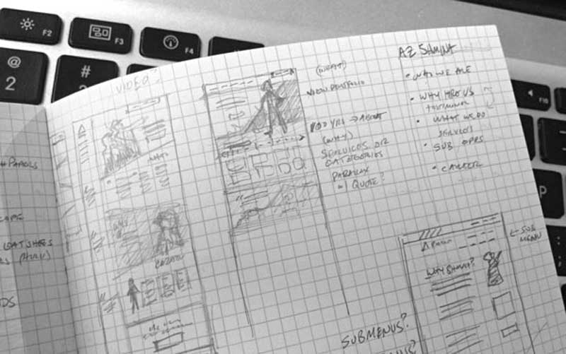
Along with establishing the tone of the new site, we needed to understand the structure: How will a visitor find the information they are looking for? What will the pages be called and where will they be positioned in the menu navigation? Reviewing the analytics of the previous site helped to determine which pages were getting the most traffic, which pages could be combined, and which content could be broken out onto its own page. We also determined which elements to highlight on the homepage, and how those elements would address each target audience.
The Design
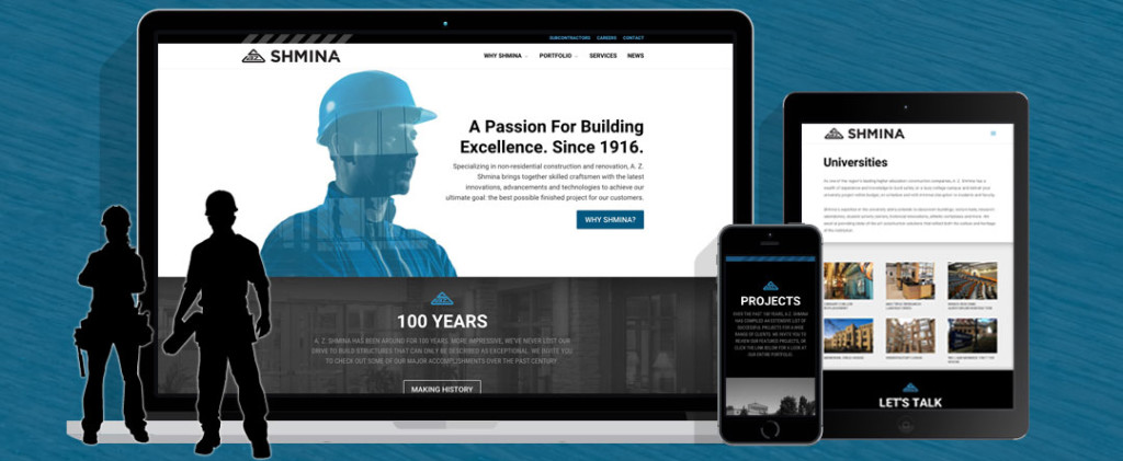
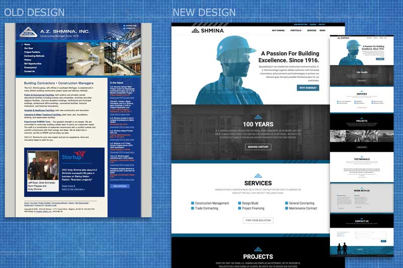
Once we had the tone and the framework nailed down it was time to design the site. We kept the minimal black and blue palette from the selected mood board and added a bolder black and white typography treatment. A subtle incorporation of video on the homepage added another layer of messaging. By enclosing the active job site inside a silhouette of a construction worker, we wanted to convey a that the AZS workers are the company’s biggest asset and that hiring AZS means hiring the right people in the right team to do the work. It’s about the process and how the work is done, as much as the finished product. This is also why we included silhouettes throughout the site, keeping the focus on the people.
[Sidenote: It is much harder than it should be to find an image of a female construction worker that actually looks like they know how to hold a drill, and didn’t just dress up as “sexy construction worker” for an office Halloween party.]
Even the including the map on the homepage supports the company’s messaging: They are a local, tangible firm. They work and live in your metro-Detroit neighborhoods.
The content provide by John supported the visual tone by including short, to-the-point titles, clear calls to action, and just enough content to say what needed to be said, but not overly complicate the site. Keeping the content streamlined also makes it easier for mobile viewers to scan through the relevant content on their device of choice.
The Development
With the design approved, the next phase was to translate the design into a living, breathing website. Birdbrook, with the help of Lauren Schaible of Foundation, designed and built a site using the ubiquitous WordPress content management system. Subcontractor opportunities, news articles and career openings all need to be kept up to date and WordPress helps make it easy for AZS to maintain their own content. The site is also built to be responsive, adapting to your browser viewing size without losing access to any content.
Once we developed the test site and populated the approved content, the client and team went through a final round of review and edits and tweaks before the site was approved for launch.
The new site showcases A.Z. Shmina’s company personality, priorities and portfolio. We hope it provides a successful springboard for the next 100 years of company growth.


